Reviewed-on: https://git.astracelestia.ovh/Salsify/logochart/pulls/25
Diverses logos de Fournisseurs et Distributeurs fictifs
Introduction
This is a little project made during my job at Alkemics. We were in need of fake retailer and manufacturer logos for testing.
The logos was required to be available in colors, white and black version to fit with the dark and light mode of the website ; but also to fit in various places, especially the toolbar that could be any colours.
Furthermore, the logo could be displayed as little as 24×24 pixels or used instead of the brand name, so it was important to be highly recongnizable in both cases.
Unilevier
The logo feature the letter 'u' of the word Universe, surronded by stars, evoking the galaxy, the space. The metaphor of the space is supported by a calming, peacful, sereine blue background — from a sky blue a the bottom to a more deep, marine blue at the top.
Nesthé 2024
The logo feature a white outline shaped like a leaf, a flame or a droplet, with the letter 't' of 'tea' in it. The leaf is inside a green circle that fade from the mint color to a warm green symbolizing nature, spring, health and calmness, with an horizontal wave in blue that evoke water. The use of elemental icons and colors is linked to what is required to make tea: a leaf in hot water.
Nesthé
The previous iteration of the Nesthé logo. The letter 't' was less italized and did not feature enought the idea of hot water.
EntresMarchés
The logo feature the letters 'E' and 'M' from the company name, in a serif font, above the shape of an old bridge. The icon evoke robustness, stability, reliability and maturity while featuring a warm red background, that grade to a warmer orange on the top left side of the squared, like a sunlight adding the meaning of vitality, energy. The use of a bridge is a reminding of shops located between each pillars.
RondPoint 2023
The logo feature the letter 'R' from the company name: Roundabout. The logo take the code of a traffic signal, replacing an actual road symbol with the stylized 'R'. The stems of the letter would evoke roadways merging into the loop — symbolizing a retailer being the merging place to go. The blue circle symbole is used in traffic rules as a mandatory rule to follow.
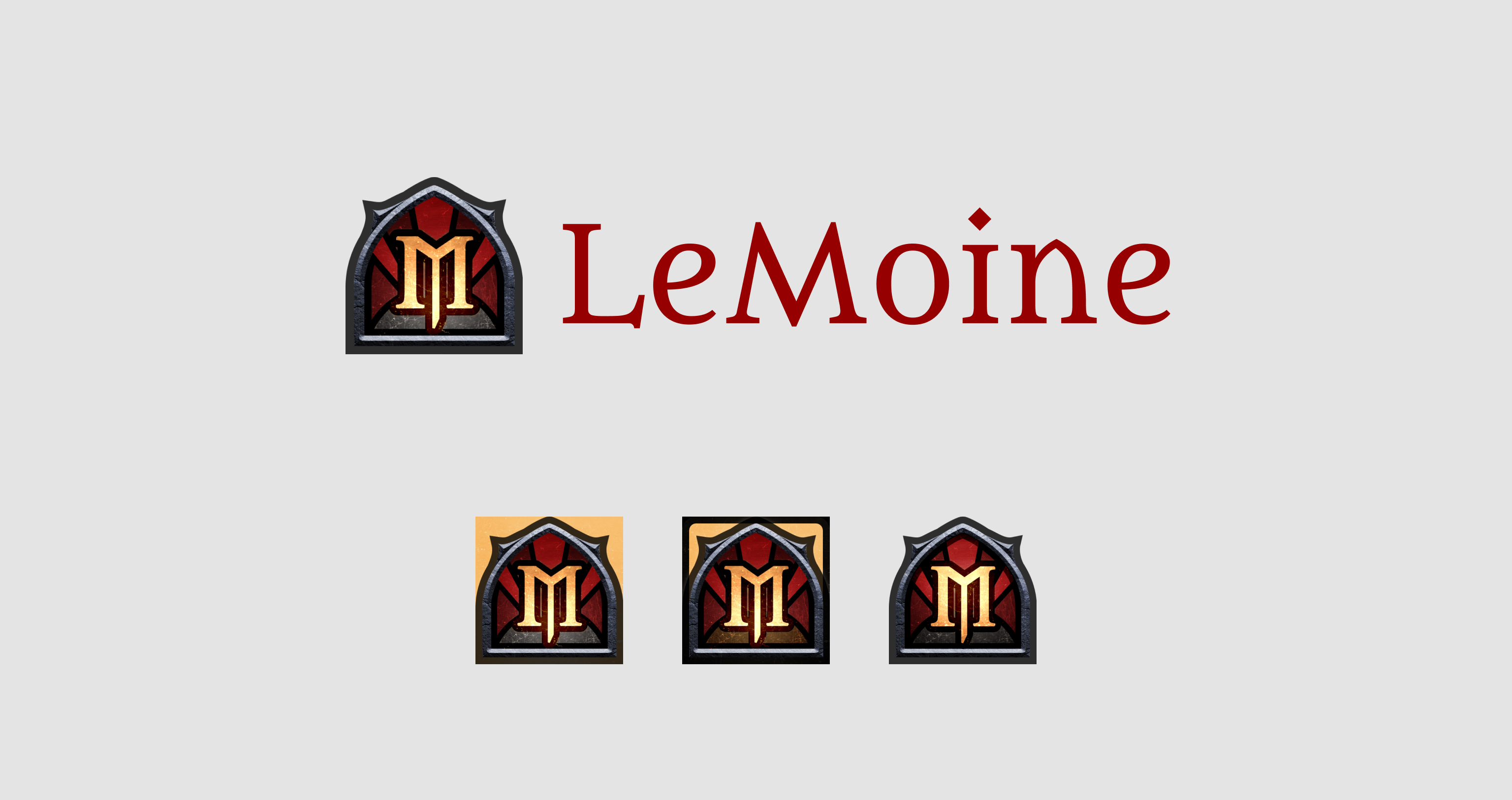
LeMoine
The logo feature a gothic stained glass containing the letter 'M' from the company name. The use of dark reds, grays, and tainted yellows evoke gloom, destruction and sorrow, the contrary of the churchy, sacred shape of the stained glass. This one doesn't have light or dark version, but have square variants to fit various places and sizes, and doesn't go on a positive vision of a brand or a retailer identity.
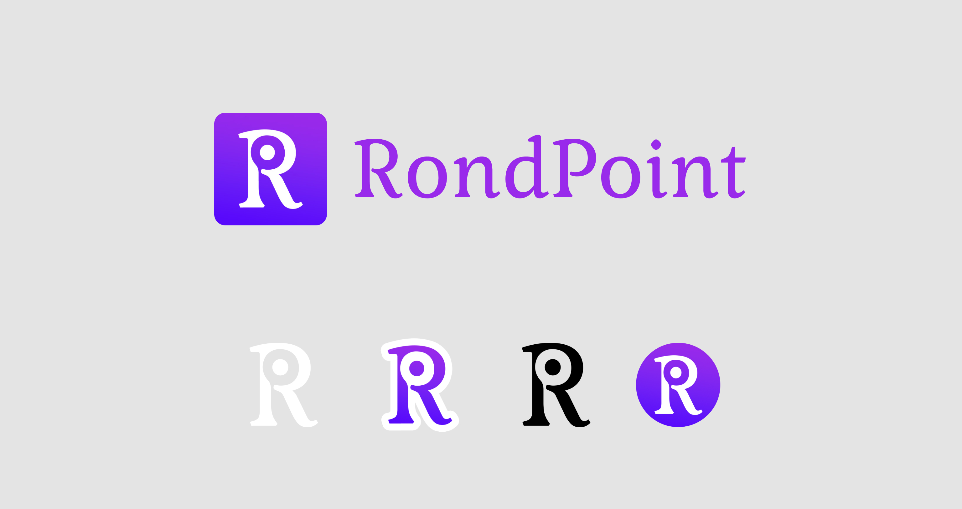
RondPoint 2022
This is the first iteration of the Roundabout brand. It was based on the concept of round, circle, rotation thus the core idea of the icon was to change the 'R' letter to make is more circular.
